
How to Do Eco Design? | 매거진에 참여하세요
How to Do Eco Design?
#EcoDesign #Trend #Visual #Language #Infographi #Color #Meaning #Communicat #Visualizat


Eco Design: Expressing Sustainability Through Visual Language
Why Eco Design Matters Now
By 2025, every brand talks about ESG and sustainability.
But simply publishing reports or attaching slogans no longer earns consumer trust.
Sustainability has become a language that must be shown, not just stated.
In this context, designers play a growing role.
Eco design goes beyond using eco-friendly materials;
it has become a methodology for visually communicating a brand’s sustainability philosophy.
Core Elements of Eco Design
Eco design can be divided into three main axes: color, typography, and icons/symbols.
Color
Green, blue, and brown tones remain dominant.
Recently, neutral tones, pastels, and biophilic palettes are used to express the diversity of sustainability.
Examples: IKEA’s nature-toned campaigns, Patagonia’s earth-inspired palettes.
Typography
Simple, bold fonts replace decorative ones to convey honesty and directness.
Lightweight sans-serif fonts are trending for their eco-friendly feel.
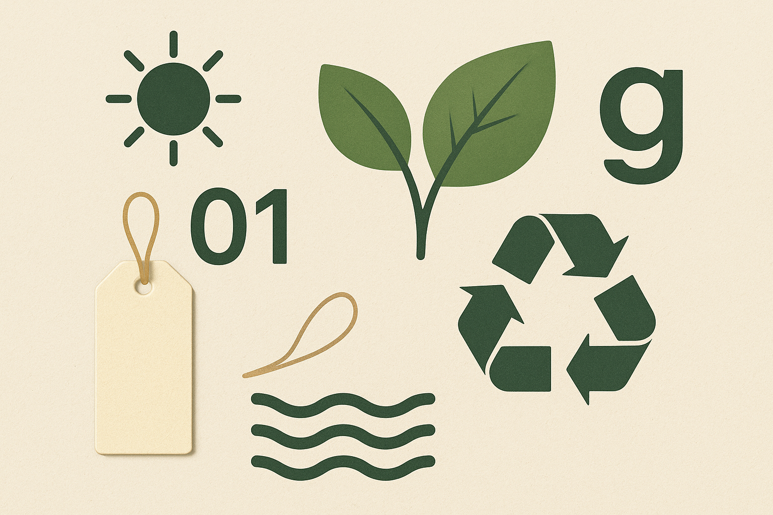
Icons & Symbols
Beyond traditional leaves, waves, and sun symbols,
designers increasingly use process-based visuals like recycling workflows, circular arrows, or carbon-neutral graphics.
Color Strategies
1. Neutral Tone
Definition: Low-saturation, calm, natural colors.
Feel: Minimalist, stable, organic.
Examples: Beige, Light Gray, Mocha Brown, Ivory, Khaki
Use: Convey authenticity and support eco/sustainability messaging.
2. Pastel Tone
Definition: Soft colors made by mixing white into primary hues.
Feel: Comfortable, friendly, cozy, lighthearted.
Examples: Pastel Pink, Mint Green, Baby Blue, Lavender, Peach
Use: Enhance positive emotions in environmental, wellness, and healing-related brands.
3. Biophilic Tone
Definition: Derived from Biophilic Design; uses natural palettes like forests, soil, sky, and sea.
Feel: Vital, organic, eco-friendly, balanced.
Examples: Leaf Green, Olive Green, Sand Beige, Terracotta Brown, Sky Blue
Use: Communicate connection to nature; often applied to eco products or campaigns.
Global Brand Examples
Patagonia
Product tags specify exact % of recycled material, making sustainability data visually accessible.
IKEA
“People & Planet Positive” campaigns emphasize sustainable materials.
Graphics use bright, transparent colors and hand-drawn illustrations for a human touch.
Apple
2023 Carbon Neutral Apple Watch: videos combined wind, water, and grass sounds with animation to
convey sustainability sensorially, not just textually.
Expanding the Designer’s Role
Eco design is more than making graphics:
- Data Visualization Designers:
Translate carbon emissions, energy usage, etc., into easily understandable visuals.
- UX Designers:
Design interfaces that encourage sustainable behavior (e.g., KakaoMap’s CO₂-saving transit suggestions).
- Brand Designers:
Embed corporate philosophy into brand identity.
Designers become translators of sustainability, turning numbers and documents into experiences and imagery.
Advantages and Challenges
Advantages:
Builds brand trust: provides visual proof of sustainability.
Encourages user participation: sustainable actions become enjoyable through design.
Global communication: transcends language barriers with universal visuals.
Challenges:
Risk of greenwashing: visuals must reflect real actions.
Over-symbolization: clichéd icons or colors can reduce authenticity.
Complexity: ESG metrics are complicated; simplification may distort meaning.
Future Outlook
Infographic UX:
Apps and services that visually communicate ESG data and sustainable actions will proliferate.
Multisensory Design:
Sustainability extends beyond sight into sound and touch.
Example: Unboxing eco-products with paper sounds or natural scents.
AI-based Simulation:
AI tools that automatically visualize product life cycles (LCA) are emerging.
Conclusion
Eco design is no longer a trend, it is a necessary visual language.
To authentically pursue sustainability, brands must design messages visually, sensorially, and experientially.
Designers are no longer mere visual creators; they are trust builders between companies and users.
The future of sustainability will thrive not through laws or strategies, but through the language of design.

- link_kakaolink_kakao_url
- link_operatorlink_operator_url
- link_investhelp@letspl.me
- link_ad_urllink_ad
